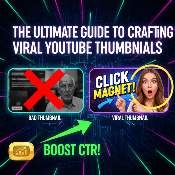
The Ultimate Guide to Crafting Viral YouTube Thumbnails

You've spent hours perfecting your YouTube video – the script is tight, the editing is flawless, and the audio is pristine. But if your thumbnail doesn't grab attention, all that hard work could go to waste. A great thumbnail is your video's first impression, and often, the deciding factor for whether someone clicks or scrolls past.
This isn't just about making something pretty; it's about making something clickable. Welcome to the ultimate viral YouTube thumbnail tutorial that will teach you the secrets to skyrocketing your click-through rates (CTR) and getting more views.
1. Understand the Psychology of a Click
Before you even open a design tool, understand what makes people click:
-
Curiosity Gap: Create a question in the viewer's mind that only your video can answer.
-
Emotion: Show strong emotions (joy, shock, anger, excitement).
-
Urgency/Intrigue: Hint at something important or surprising.
-
Relatability: Use imagery that your target audience can connect with.
2. Keep it Clean & Clutter-Free
Thumbnails are small! On mobile, they're tiny.
-
Minimalism is Key: Avoid too many elements. Focus on one or two main focal points.
-
Clear Subject: Your main subject (person, object, text) should be immediately recognizable.
-
Strong Contrast: Ensure your foreground elements pop against the background.
3. Use Faces and Expressive Emotions
Human faces are powerful. We're hardwired to look at them.
-
Direct Eye Contact: If applicable, have your subject looking directly at the viewer.
-
Exaggerated Expressions: Show clear, strong emotions that convey the video's mood (e.g., surprised, excited, serious).
-
Close-Ups: Often, a close-up of a face works better than a full-body shot.
4. Text: Less is More & Make it Readable
Text on thumbnails should be used strategically:
-
Limit Your Words: Aim for 3-5 words maximum. The goal is to tease, not explain.
-
Big, Bold Fonts: Use sans-serif fonts that are easy to read at a small size (e.g., Montserrat, Bebas Neue, Impact).
-
Outline/Shadows: Add an outline or drop shadow to your text to make it stand out from the background.
-
Color Contrast: Ensure high contrast between text color and background color.
5. Leverage Color Psychology & Branding
Colors evoke emotions and can make your thumbnail stand out.
-
High-Contrast Colors: Use complementary colors (e.g., blue and orange) to create visual pop.
-
Brand Consistency: Use your brand colors or a consistent color scheme across your thumbnails to build recognition.
-
Avoid Muted Tones: Bright, vibrant colors often perform better in the crowded YouTube feed.
6. The "Before & After" or "Problem & Solution" Formula
These are incredibly effective for tutorials, reviews, and transformation content:
-
Side-by-Side Comparison: Visually show the contrast.
-
Arrows/Circles: Use clear indicators to draw attention to the key transformation.
-
Implied Transformation: Even if not a direct B&A, hint at a massive change or discovery.
7. Analyze & Adapt
No viral YouTube thumbnail tutorial is complete without mentioning analytics.
-
Check Your CTR: Go to YouTube Studio > Analytics > Content and check the "Impressions click-through rate" for each video.
-
A/B Test: Experiment with different thumbnail designs. Some tools allow you to test two thumbnails against each other.
-
Learn from Top Creators: Study what popular creators in your niche are doing. What makes their thumbnails stand out?
Conclusion
Crafting viral YouTube thumbnails isn't a dark art; it's a skill that can be learned and refined. By applying these principles, you'll transform your thumbnails from overlooked images into irresistible click-magnets. Remember, your video might be gold, but it needs a shiny package to get noticed.
